Canucks: Ranking every jersey in franchise history from worst to best

Vancouver Canucks (Photo by Rich Lam/Getty Images)
1 of 3
Next
Vancouver Canucks (Photo by Rich Lam/Getty Images)
Vancouver Canucks (Photo by Rich Lam/Getty Images) /

With the Vancouver Canucks releasing reverse retro jerseys, now’s a good time to rank every single jersey in their history from worst to best.

The Vancouver Canucks released their reverse retro jerseys earlier this week, which received mixed results from the fans.

The orca logo, design and gradient colours have caused debate among social media platforms. It actually gave Canucks Twitter something to argue about with no hockey going on right now.

The Canucks have worn many different jerseys throughout their 50-year history. In fact, few NHL teams have undergone as many drastic jersey changes as the Canucks.

With that all said,, let’s rank every jersey in franchise history from worst to best.

10. Flying V: 1978-1985

The Flying V takes the last spot here. It is most associated with the Canucks’ first run to the Stanley Cup Finals back in 1982.

It featured a large V across the front. (Not sure if it stood for victory or Vancouver. I’ll go with the latter.)  The red-orange look of the V was created to form an atmosphere that would “help create the happy, upbeat, aggressive player,” according to jersey designer Bill Boyd.

However, I think this is the worst jersey the franchise has ever worn.

The V logo doesn’t look that appealing to me. It looked okay on the black jerseys, but definitely not on the yellow ones. It looked the V was spread on a jersey made out of mustard. They looked more like uniforms for a fast food place. To me, the design of the flying jerseys look bland and uninspiring.

In fact the players weren’t fans of it either.

“Well, last year we played like clowns, now they’re dressing us like them,” former Canuck Jack McIlhargey once said.

9. Heritage Jersey: 2019 – Present

This jersey is a nice call back to the original Canucks jerseys. The White stick-in the rink jersey has a nice touch to it as well as the dark blue. However, the green stripes at the bottom ruin it.

It just makes the uniforms look boring. It would have been better if one of the stripes were white, instead of making them both green.

8. Millionaires Heritage Jersey: 2013-2015

These weren’t as bad as I remembered. The Millionaires jerseys were worn for a few games —  including the 2014 Heritage Classic at B.C Place — from 2013 to 2015 to pay homage to the Vancouver Millionaires, who won the Stanley Cup in 1915.

The maroon colour and the white V with Vancouver engraved in it provided a simple but decent look. The alternating stripes maroon and white stripes on the sleeves were also a nice touch.

As nice as they were, the Canucks lost every game they played in them, including the aforementioned Heritage Classic against the Ottawa Senators.
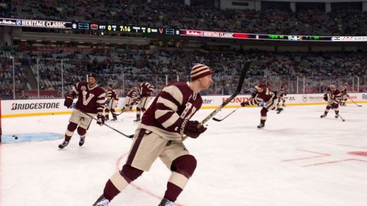
Vancouver Canucks (Photo by Jeff Vinnick/Getty Images)
Vancouver Canucks (Photo by Jeff Vinnick/Getty Images) /

7. Salmon Skate: 1995-97

I may get a lot of hate for putting the “salmon” skate alternate jersey this high. Honestly, it really doesn’t look that bad.

The flying skate in the middle of the black and yellow stripes looks pretty neat and the “salmon” red is beautiful. I am glad they were only the third jerseys, however, because they probably would have grown stale after awhile.

More from The Canuck Way

6. Gradient Orca: 2001-07

This is also another one some Canucks fans aren’t too particularly fond of.  Again, I personally think this jersey isn’t that bad at all.

The gradient red to blue looks alright. I do like the red shoulders and the dark blue on the bottom. The logo also sits well with the gradient look. This jersey is also a memorable symbol of the West Coast Express era.

5. Reverse Retro: 2020 – Present

This was unveiled earlier this week, and the more I look at it, the more I like it.

This is an upgrade from the early 2000s gradient jerseys. The gradient blue works really well with the green and the current orca logo.

The white stripes are also a nice touch. I can’t wait to see what it would look like with full gear on the ice. The Reverse Retro jersey would make a good Christmas gift.

4. Original Orca: 1997-2007

This one may provide bad memories to some people. When this jersey was announced, it was the beginning of the unfathomable Mark Messier and Mike Keenan era. However, there was also the West Coast Express era that followed — and those were much more exciting times.

The black worked really well with the blue, grey and red stripes. The away jersey looked even better; they had a clean look to it, and the orca logo fit nicely with the blue, grey, black and red stripes.

My only problem with this jersey is the orca looks like it has bleeding gums. Maybe it needs more vitamin C.

Vancouver Canucks (Photo by Focus on Sport/Getty Images)
Vancouver Canucks (Photo by Focus on Sport/Getty Images) /

3. Stick In Rink :1970-78, 2006-07, 2008-2017

I decided to lump in all three versions of the stick-in-rink jersey because they are practically the same , only with minor changes to the design.

This jersey is simple, and sometimes the simple option is the best one. The logo is a bit boring, but on all versions of the jersey, it goes with the blue background as well as the stripes which were usually green and white.

The dark blue mixes well with green. It fits well with the west coast, too, as the blue could represent the oceans and the green could the represent trees.

The stick-in-rink was the Canucks primary jersey in the ’70s. It eventually returned as an alternate in the 2006-07 season and from 2008-09 to 2016-17.  There was also a special version of the jersey that was worn for select game during the 2010-11 season as part of the franchise’s 40th anniversary seasons. (It looks so much cooler in white.)

2. Current Orca: 2007-Present

This would be lower on the list if they didn’t remove the Vancouver wordmark (I’m glad they finally did in 2019). It just didn’t need to be there.

I mean, everybody knows where the Canucks play, and you don’t need to tell remind them that it’s in Vancouver.

That being said, even with the woodmark, the current jerseys are awesome and even better without it. The orca doesn’t have a vitamin deficiency (or gingivitis?) this time. Some people hate the orca logo (possibly because it was introduced when the Canucks were bought by then-named Orca Bay Sports and Entertainment), but I think it is a great symbol for Vancouver and the West Coast.

Overall, it works really well with the blue and green. Orcas are majestic animals and apex predators. The away jerseys look just as nice; the blue and green stripes stand out on the sleeves and on the bottom.

The current jersey, in my opinion, is the best representation the Canucks have for the city and the province of B.C.

1. Flying Skate: 1989-97, 2016, 2019- Present

This is the best of the best, and I’m sure many of you will agree. What is there not to like about the Flying Skate jersey? The logo has a great look, and the colours of black, yellow and red go together nicely. The striping has a wonderful design, and the whole thing looks better on the ice.

The Flying Skate brings back nostalgia of the 1994 Stanley Cup run when Pavel Bure, Trevor Linden and company captured the imaginations of countless Canucks fans.

Next. Canucks: Should Braden Holtby open the season as the starter?. dark

Simply put, the Flying Skate is a perfect hockey jersey, and one of the the NHL has ever seen.

Next