How to pick the right Vancouver Canucks jersey to buy
With the Vancouver Canucks releasing some hot new alternate jerseys this season it’s made it harder and harder for fans such as myself to decide what ones to get. This has been my journey on how to decide on what jersey to get.
There are a few dilemmas that I have discovered when picking out your new Vancouver Canucks threads. Jerseys have become so expensive that it’s not just an impulse purchase anymore, get the wrong one and you risk your player getting traded before you’ve gotten your money’s worth. There are three styles to choose from.
The Orca
With the addition of the classic flying skate logo and the redesigned stick in rink logo, there are more options than ever when deciding on what design you’re going to go with. They all have their pros and cons.
More from The Canuck Way
- Which team won the Bo Horvat trade?
- What to expect from newcomers Anthony Beauvillier, Aatu Räty
- Back to the future: How the skate uniforms became a regular Canucks’ feature night
- Canucks kick off 2023 with disappointing 6-2 loss to Islanders
- 2nd period penalty trouble sinks Canucks in 4-2 loss against Winnipeg
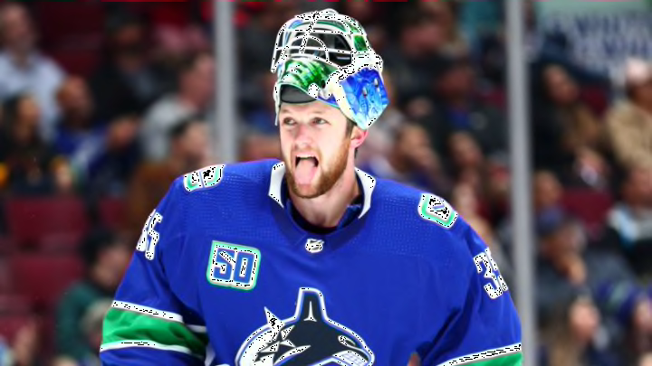
The primary orca jersey is still the mainstay of the Canucks, so you’ll see the team wear the jersey that you’re buying more often than not. It’s a safe bet and you’ll never have anyone asking you what team you’re wearing — believe me it happens. The Orca has had one key design update that makes it look a lot better than years prior, the “Vancouver” lettering is gone, this makes the Orca the primary subject of the jersey.
One downside to this jersey is that they fail to stand out in the crowd of Canuck fans standing in line at the concession, the new design does give you a bit of flair in comparison to the older ones but its fairly ordinary nonetheless. Many people simply don’t like the orca for some reason or another whether they associate it with a different era or are tired of the same logo for 22 years straight.
Fans who grew up during the reign of the orca between 1997 and now have really only known this logo and it plays a special role in their hearts.
The skate
The “flying skate” or “spaghetti plate” jerseys are very fierce, this logo was used between 1985 and 1997, a period where they qualified for the playoffs eight of 12 seasons, including two division titles and their first heartbreaking cup run, it was the first “good era” of Canucks hockey. The black of the jersey is so sleek and turns heads of Canucks fans and just looks like a more fashionable jersey.
This jersey has a very nostalgic effect on a lot of older Canuck fans, bringing them back to a time of their early adulthood or teenage years.
These jerseys are a classic, but thats what they are and they don’t represent the current era of Canucks hockey. They only use these jerseys three times throughout the year. During a playoff game you want to bleed blue and green, this jersey has neither.
The stick in rink
The redesign on this OG jersey hit the nail on the head with the logo by putting a modern spin on it. This logo puts the best of both the colours of the team as well as standing out from the masses with an alternate look.
The troubles with this jersey is that it’s so close, it was so close. The double green lines at the bottom really doesn’t do anything positive for me on the design and makes it look unfinished. It’s an entirely personal opinion and if this jersey appeals to you the Canucks wear it 10 more times this season.
Picking a player
Choosing what player to put on your jersey can seem like a daunting task, much like choosing a style it comes down to three things.
Skilled for celebrations
One of the best things about owning a jersey is identifying with the player on the back, and when you get to take part in the glory when your guy scores I imagine the people on the TV flaunting their Ryan Kesler jerseys during the Nashville series when he took over. Having a skilled player on your jersey can be amazing, but everybody and their dog is representing the best players on the team.
Having the best player’s name on the back of your jersey adds for some added security because they will be a high-value piece for the team. But, if a player not getting traded is your main reason to choose them on the back of your jersey, choose Loui Eriksson.
Some examples include: Elias Pettersson, Brock Boeser, J.T Miller, Quinn Hughes, and maybe Jacob Markstrom.
Character guys
Choosing a player who plays a rough and tumble type of hockey can be a great way to show off your favourite player, Alex Burrows and Kevin Bieksa reminds me of that type of player. These players have more of a chance at getting traded than the skilled guys but sometimes last even longer if they are imperative to the success of the team.
Some examples include: Bo Horvat, Alex Edler, Jake Virtanen, Tanner Pearson, and Tyler Myers
Potential future stars
If you’re down for a little risk factor you could take a gamble on a young gun. These kids could miss some games by either playing the AHL or getting healthy scratched in favour of another player. These players could even be packaged in trades to improve the team at the trade deadline.
Oh, how sweet is it when they finally make it and you have the jersey, this year they even have timestamps with the 50th year to say you got it first!
Some examples include: Adam Gaudette, Zack MacEwen, Thatcher Demko, and Nikita Tryamkin (if he ever arrives).
The path to your dream jersey is a tough one and I hope I made it a little bit easier, but everyone has their own thoughts and preferences. Canucks jerseys on Vanbase are going for $280-$298 plus tax, its a steep price to pay for fandom but its an experience. I’ll be getting my jersey November 5th before the game I’m going to and I haven’t even begun to narrow down the player search.