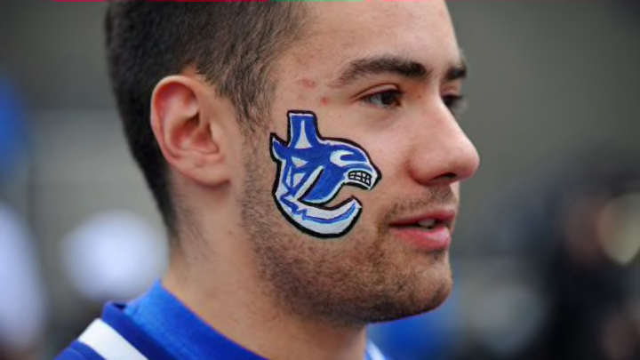
The Vancouver Canucks have had many logos in their history but the longest serving one by a landslide is the Orca. Fans have become divided on this logo and the reception of the alternate jerseys this season has only solidified that fact.
For over 20 years the Vancouver Canucks have donned the Orca as their primary jersey, so why is there so much animosity towards the logo? The Canucks had the perfect opportunity to change it up in the 2019-2020 season symbolizing a new start after the team had floundered the last 4 years and the “rumoured” announcement of a new captain at the beginning of the season.
Orca Bay Sports and Entertainment purchased the Canucks and at the time, GM Place (Currently Rogers Arena) which replaced Northwest Sports Enterprises in 1995. Two years later in 1997, the team changed logos to the Orca, replacing what many call the best Canucks jersey, “The Flying Skate”.
More from The Canuck Way
- Which team won the Bo Horvat trade?
- What to expect from newcomers Anthony Beauvillier, Aatu Räty
- Back to the future: How the skate uniforms became a regular Canucks’ feature night
- Canucks kick off 2023 with disappointing 6-2 loss to Islanders
- 2nd period penalty trouble sinks Canucks in 4-2 loss against Winnipeg
The main arguments that I often hear when asking why people hate the orca is “Canucks aren’t orcas, it means Canadian, which is why Johnny Canuck makes sense,” or “We’re done with Orca Bay why haven’t we moved on from that stupid whale?”. While I looked across the league at the logos teams have now, most do represent literally what the names suggest but a few that don’t are; the Boston Bruins, the Columbus Blue Jackets, the Montreal Canadians, the New York Rangers, and the Washington Capitals.
Three of the teams listed above have iconic logos that have lasted since the original six and it has nothing to do with their name. The reason people should like the Vancouver Canucks logo is what the Orca represents. This excerpt from spirits of the west coast symbolizes what the Orca means for Indigenous people and brings Vancouver back to where we come from.
"“The Native Orca Symbol or Killer Whales symbolizes family, romance, longevity, harmony, travel, community and protection. He is said to protect those who travel away from home, and lead them back when the time comes. The Killer Whales live like wolves and raise each child with care.”"
Many people aren’t aware of First Nations history, and to be associated with such a strong symbol of an iconic community should be an honour. The location of Vancouver should also be a reason for the Orca to represent us well, Vancouver is right on the west coast, home to many Orcas.
Last but not least, Orcas are apex predators, the prey of none and predator of many. The Orca Whale is a dignified creature and us fans should be happy to have the Orca represent our team. The third jersey and alternates can be a very pleasant change and after 22 years many people do crave change, but the grass is not always greener people.
